Pygg
Pygg
🏆 Winner of the Mento Design Award
👤 Role: UX Designer
👥 Team: “Ctrl+S” (Carmen T, Jancis W, Syd B)
🕒 45 hours (Feb 2023)
🛠️ Figma, FigJam, Adobe Illustrator
Check out the interactive prototype here! 📱
Background
This project was created for Build ’23, a virtual hackathon focused on affecting change for social good through design and code. Our team decided to focus our solution on the concept of reducing social inequalities. We spent 45 hours working hard on our deliverable, a mobile app, and ultimately won the Mento Design Award for best UI/UX Design.
Identifying the Problem
4.8 million Canadians are living in low-income households. This number may sound staggering — and it should. In fact, many structural societal issues are at play:
Income inequality — The top 10% of income earners in Canada earn more than 33% of total income.
Employment instability — Many individuals work part-time with low pay and little job security.
Systemic discrimination — Certain groups, such as Indigenous peoples, are more vulnerable to experiencing low income.
With the UN Sustainable Development goals in mind, our team wanted to narrow our focus to eliminating poverty (1) and reducing inequalities (8) through providing quality education (4).
I took an iterative (agile) approach between steps, creating the MVP as soon as possible so I could test my prototype and iterate based on user feedback.
Design Process
With only 45 hours on the clock (and the need to eat and sleep, of course), we budgeted our time as follows:
Discover (3 hours) — Brainstorming possible solutions for our chosen track.
Define (7 hours) — Honing in on our solution through research and further ideation.
Develop (3 hours) — Brainstorming the key features of our MVP using Crazy 8’s and affinity mapping.
Deliver (15 hours) — Design sprints: wireframing, prototyping, and iterating based on internal team feedback to create the most effective solution.
The User
Our target user is between the ages of 15-24 (youth as defined by the UN) who is from a low-income background and wants to learn how to manage their finances. We chose this age group because our research findings indicated that young adults have the highest poverty rate of all age groups. By starting their education in their teens and throughout adulthood, we hope to set them up for financial success.
We further narrowed down our focus by creating Anna as our primary persona. Through our entire design process, we kept Anna’s goals, needs, and pain points in mind.
Research Insights
Considering the short time frame and lack of access to interviewees, so we focused on secondary research, which I was responsible for conducting. Through looking at reputable sources regarding Canadians’ financial situations, I arrived at several important insights:
Financial literacy is a critical social determinant of health.
Other than lack of financial literacy, other barriers to young adults’ financial wealth included lack of trust and lack of reliable sources.
The educational experience is improved when the user feels involved and has autonomy — an idea that many other apps have successfully utilized.
This led us to begin our competitor research. After looking at numerous apps for financial literacy and general education, we decided to draw inspiration from Mint and Duolingo.
Mint is also a finance app, though its primary focus is budgeting and financial planning rather than the educational piece, and focuses on a broader target market. Mint’s simple interface and colloquial language adds fun and excitement to financial planning.
Duolingo is an app for language learning, and is very well known for its mascot, Duo. We drew inspiration from this personable mascot that guides the user through the learning process, as well as the app’s self-paced learning journey.
Ideation & Workflow
Thus, we arrived at our idea: an app that teaches hands-on financial literacy, giving users the autonomy to save for their own goals and learn at their own pace, packaged in a relaxing and fun UI.
To define the product requirements, we held “Crazy 8’s” sessions to get our ideas flowing. Then, we used affinity mapping to group our ideas together. My role was to lead the workshop for affinity mapping, identifying similar concepts and rerouting our efforts to our common goals. When team members couldn’t agree, I allotted 2 ‘dots’ per team member, giving each member 2 votes on which ideas they felt were most important. This helped speed up our workflow immensely by creating scarcity and forcing us to prioritize what was important.
Not all of our ideas could be realized due to time constraints, so we focused greatly on the categories with the most ideas: Gamification/Rewards and UI.
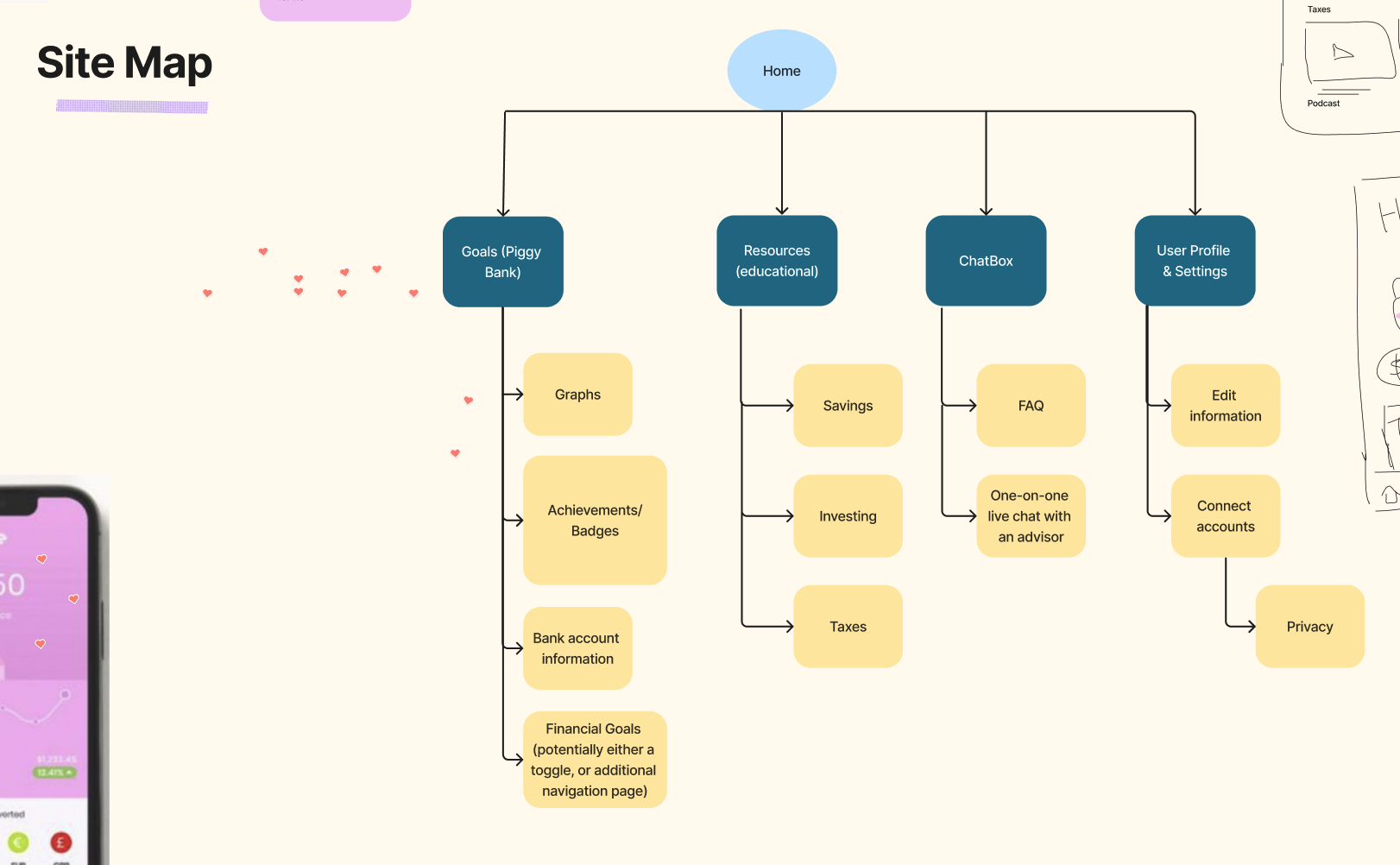
We then created a sitemap to lay out the information architecture of the most important screens that the user would see.
After that, we decided on the 3 most important tasks the user would want to complete in our app, and mapped out task flows and user flows.
Task Flows (click to enlarge)
User Flow (click to enlarge)
Finally, we decided on the name for the app: Pygg, an old English word referring to clay jars where money is stored. This word eventually evolved into the word “piggybank.” The name of the app holds two meanings — it represents our pig mascot, as well as calling to mind the concept of financial management.
Wireframes
Now that our concept and key tasks had been hashed out, it was time to create our wireframes. We focused again on the 3 flows we had brainstormed and began to lay out our UI elements. It was here that we started incorporating sketches of our pig mascot, the friendly face that would guide Anna through the app.
Here, I worked primarily on the home page, educational resources, chat layout, and putting together the components for our lo-fi design system.
Design System
I had a key role in creating the design system for Pygg, using well-researched grid systems and type hierarchies to make sure that the UI was clean and pleasing to use. I made sure all components were documented and easily reusable.
Colours — We used calm, friendly colours in our design — green for money and wellness, and pink for pigs. The accent colour, yellow, also represents money while adding a kick of brightness and fun. All colour contrasts of our text and buttons meet WCAG accessibility standards.
Typeface — Our typeface, Larsseit, is a modern and friendly sans-serif. Its rounded nature makes the user feel at ease when reading on the app. It is easily legible, and all text is at least 16pt for accessibility standards.
Logo — Our text logo is “pygg” in all lowercase to give an informal feeling, plus an additional “pig’s tail” to call to mind our pig imagery.
Illustrations — Pygg, our 2D vector mascot, is round, playful, and simple without being overwhelming. We also add coins and bills throughout for a financial motif. In addition, pig footprints can be seen in the background of every screen, suggesting the user and Pygg taking steps forward in financial management together.
Hi-Fi Prototype
Regrettably, we couldn’t conduct detailed usability testing under the short time constraints. Thus, after creating our lo-fi, we jumped right into designing the hi-fi prototype.
Lessons Learned
Project management is key. — In a project with such short time constraints, every second counted. What helped our team was taking the time at the start of the hackathon to block out specific time frames for each task — including breaks. Even though we ended up exceeding some of the allotted time frames, it helped give us a picture of what stage of the project we were at, and the blockers we needed to overcome to get ahead.
Teamwork makes the dream work. — I couldn’t be prouder of the way our team pulled through in collaborating with one another. We respected each others’ input at all stages, taking care to bounce ideas off one another, and allowing everyone to speak up equally. Even under pressure, it is so key to communicate with honesty, be empathetic, and stay open-minded. When you work with great people, you see great results.
If I could re-do this project... — One key step that was missing during this project was direct user input. Since we were under a time crunch, we couldn’t conduct user interviews or usability testing, so that’s definitely something I would prioritize if we had more time.
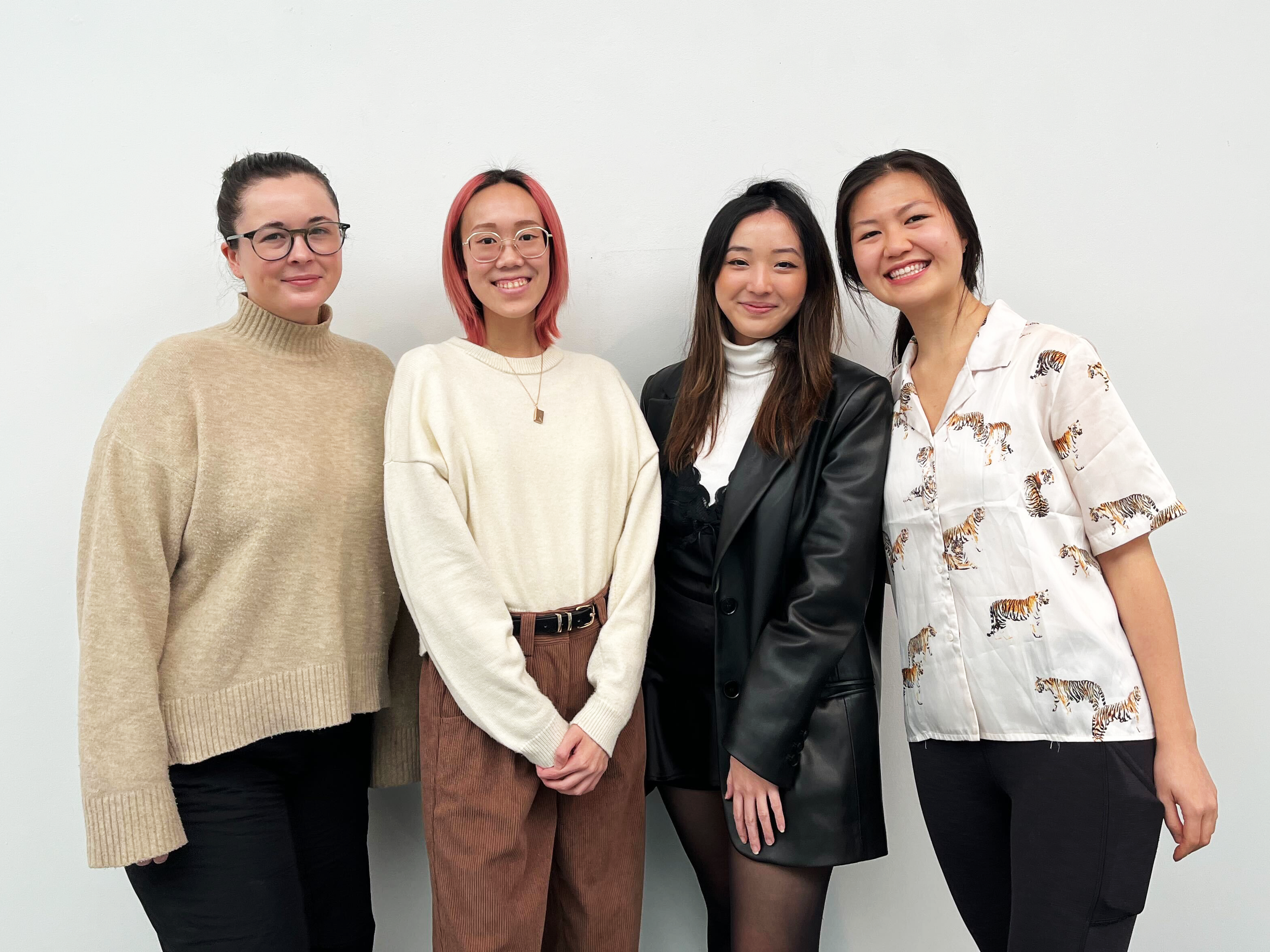
Team Ctrl+S (Sydney, Diana, Carmen, Jancis)
Team Ctrl+S, but fun!
You can read more about Pygg and our team on the Emily Carr website.


